Painting & Decorating

Painting & Decorating

Painting & Decorating: The Finishing Touch That Transforms Your Home

Painting and decorating are often the final stages of a home renovation, but they play a much bigger role than simply adding colour to a room. A professional finish protects surfaces, improves durability, and brings every design element together. Whether you’re updating a single room or renovating your entire property, quality painting and decorating can completely transform the look and feel of your home.

Why Professional Painting Matters

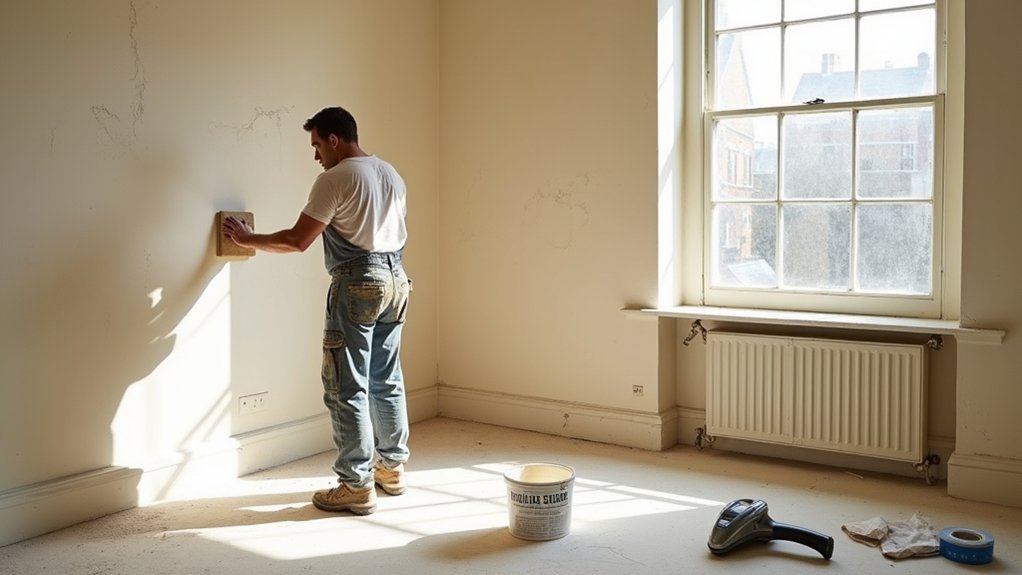
A great paint job starts long before the first coat is applied. Proper preparation is essential for achieving a smooth, long-lasting finish. This includes repairing cracks, filling holes, sanding rough surfaces, and applying the correct primer where needed. Skipping these steps often leads to uneven finishes, peeling paint, and a shorter lifespan.

Professional painters understand how different surfaces require different preparation methods, ensuring every wall, ceiling, and woodwork receives the right treatment before painting begins.

Choosing the Right Colours

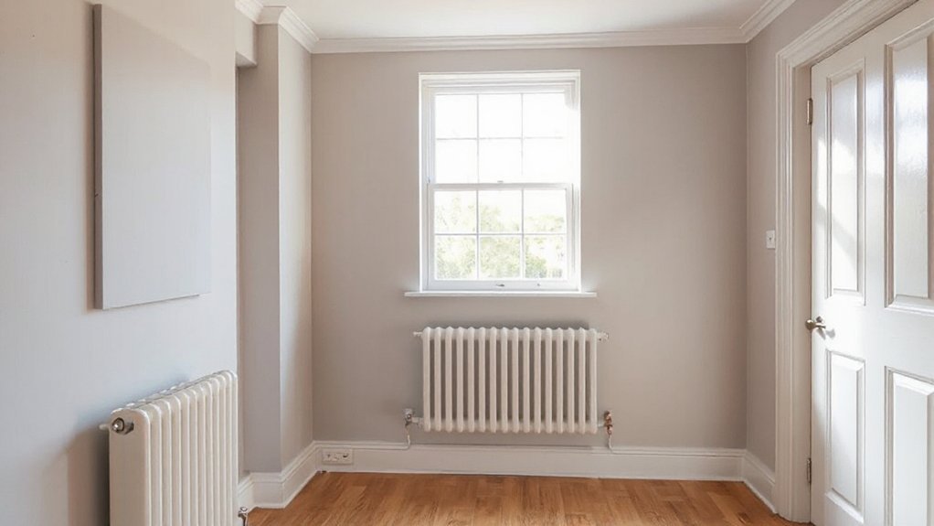
Colour has a significant impact on how a room looks and feels. Light shades can make smaller rooms appear larger and brighter, while deeper colours create warmth and character. Neutral palettes remain a popular choice because they complement a wide range of furniture and décor styles.

When selecting colours, it’s important to consider:

  • Natural lighting
  • Room size
  • Existing flooring
  • Furniture colours
  • Overall design style

A carefully planned colour scheme creates a balanced and cohesive appearance throughout the home.

Interior Painting Services

Interior painting covers much more than walls. A complete decorating project may include:

  • Walls and ceilings
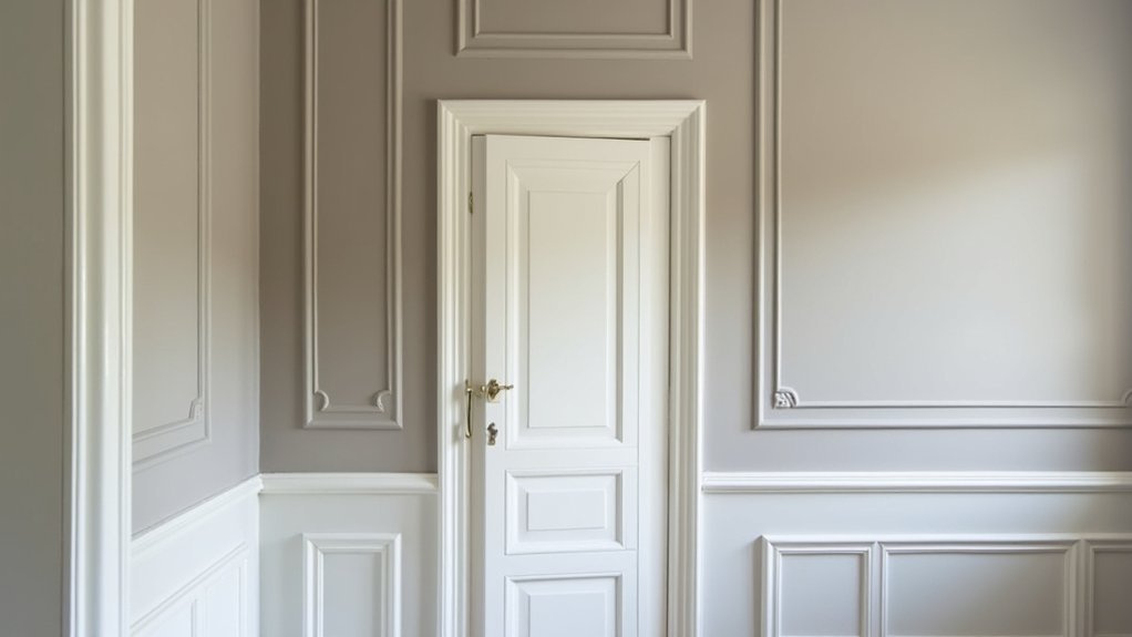
  • Doors and door frames
  • Skirting boards
  • Window frames
  • Staircases
  • Built-in cabinets
  • Feature walls

Attention to detail across every surface helps create a polished finish that enhances the overall quality of the renovation.

Exterior Painting

The exterior of your property is constantly exposed to changing weather conditions. High-quality exterior paints help protect brickwork, render, timber, and masonry from moisture, UV rays, and general wear.

Regular exterior painting can improve kerb appeal while helping extend the lifespan of your home’s exterior surfaces.

Wallpaper and Decorative Finishes

Wallpaper remains a popular option for adding texture and personality to living spaces. Feature walls, textured wallpapers, and modern patterns can create striking focal points without overwhelming a room.

Decorative finishes can also include specialist paints, feature colours, wood staining, and protective coatings that enhance both appearance and durability.

Surface Preparation Makes the Difference

The best decorating results always begin with careful preparation. Professional preparation may involve:

  • Filling damaged plaster
  • Sanding uneven surfaces
  • Removing old wallpaper
  • Cleaning walls
  • Priming bare surfaces
  • Protecting flooring and furniture

These steps help achieve an even finish that lasts for years.

Painting During a Home Renovation

Painting and decorating are usually completed after structural work, plastering, electrical installations, and carpentry have been finished. Completing decorating at the right stage prevents unnecessary damage and ensures every surface receives a clean, professional finish.

When all trades work together, the final result looks consistent throughout the property.

Benefits of Professional Decorating

Professional painting and decorating provide several long-term advantages, including:

  • Higher quality finishes
  • Better protection for surfaces
  • Longer-lasting paintwork
  • Improved property appearance
  • Increased home value
  • Less maintenance over time

Quality workmanship ensures every room looks finished rather than simply painted.

Keeping Painted Surfaces Looking Their Best

Regular maintenance helps preserve freshly decorated surfaces. Gentle cleaning, avoiding harsh chemicals, and repairing small marks early can keep walls and woodwork looking fresh for many years.

Choosing washable paints in high-traffic areas such as hallways, kitchens, and children’s rooms can also make ongoing maintenance much easier.

Conclusion

Painting and decorating complete the transformation of any home renovation project. From careful preparation and colour selection to the final finishing touches, professional workmanship creates attractive, durable spaces that homeowners can enjoy for years. Whether refreshing a single room or renovating an entire property, investing in quality painting and decorating helps protect your home while delivering a beautiful finish that stands the test of time.…

old plaster wall preparation
Painting & Decorating

Preparing Old Plaster Walls for Painting: Essential Tips for British Properties

Before you paint old plaster, you’ll check for damp with brown paper or a meter, trace leaks or bridged DPCs, and spot salts by powdery blooms and tide marks. You’ll tap for hollows and watch cracks for movement, then you’ll scrape back loose paint to sound edges and brush away dust. You’ll repair with lime-compatible fillers and reattach blown areas. You won’t use PVA; you’ll tame suction with a breathable stabiliser or 70/30 mist coat, and there’s more to follow.

Key Takeaways

  • Check for damp, condensation, and salt blooms first; fix gutters, ventilation, and bridged DPCs before any decorating work.
  • Scrape only loose paint and friable distemper back to sound edges; avoid aggressive sanding that damages lime plaster and historic texture.
  • Test for powdering and over-suction; use a breathable stabiliser on friable areas, not vinyl sealers that trap moisture.
  • Repair cracks and hollow plaster with compatible lime-based fillers and reattachment methods; mist lightly to control suction before filling.
  • Apply a properly diluted mist coat (70/30 or 60/40 water-to-emulsion), let fully dry, then add breathable top coats evenly.

Check Plaster for Damp, Salts, and Movement

inspect plaster before painting

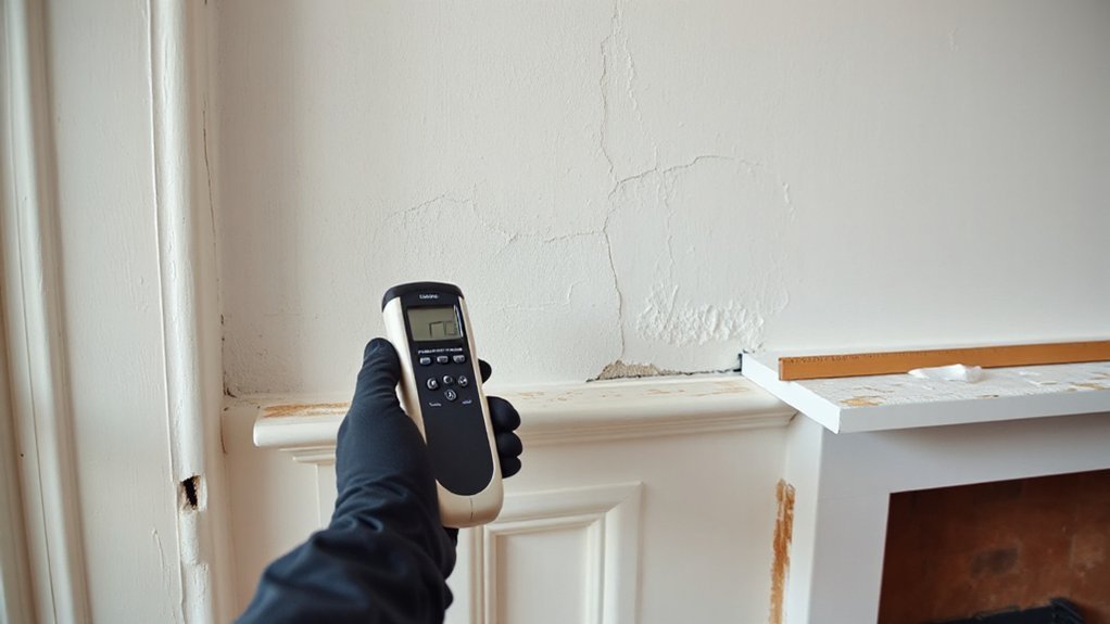
Before you lift a brush, examine the plaster as a conservator would: test for damp, salts, and movement, because each fault will defeat fresh paint and can worsen the fabric if you seal it in.

Begin with moisture detection: press clean brown paper to suspect patches, note darkening, and take readings with a capacitance meter, then confirm by ventilating and rechecking.

Trace sources—leaking gutters, bridged DPCs, trapped condensation—before you consider any finish.

Next, look for salt contamination: powdery bloom, friable faces, or tide marks. You’ll often find chlorides and nitrates near hearths, chimneys, and ground floors; record extent, don’t wash them deeper.

Finally, test movement by tapping for hollows and watching cracks through a week’s humidity change.

Scrape Loose Paint and Remove Flaking Areas

Once you’ve proved the plaster is sound and dry, turn to the old finish and take off only what’s already failed: scrape away loose paint, blistered distemper, and any friable edges until you reach a firm, well-adhered margin.

Use a sharp filling knife or shave-hook, keeping the blade shallow so you don’t bruise the lime surface or alter the wall texture that gives period rooms their character. Work methodically, tapping and watching for lifting at edges; stop when the coating resists.

Collect dust and chips as you go, and brush down with a soft hand brush rather than scouring. If you find many generations of paint color, record them before removal, then feather sound edges lightly for a tidy transition.

Fix Cracks and Reattach Blown or Hollow Plaster

With the loose finish pared back to firm edges, you can now deal with the wall itself—cracks that telegraph through paint and areas of plaster that sound hollow when you tap them.

Open hairline cracks slightly with a fine scraper, rake out dust, then mist lightly to temper suction. Press in a compatible lime-based filler, keeping the plaster texture in mind so the repair sits flush without a modern skim.

For blown plaster, locate sound margins by tapping, then drill small holes through the face into the void. Inject lime slurry or adhesive formulated for historical restoration, working from the lowest hole upward until it returns.

Gently draw the plaster back with washers and screws, protecting the surface with card. Remove fixings once set, fill, and feather edges carefully.

Sand Plaster Walls: Grit Guide and Dust Control

Although plaster rewards a light hand, you’ll need to sand selectively to level filled cracks, soften trowel marks, and knock back only the high spots that would catch the light under paint. Start with 120–150 grit on a cork block for repairs, then finish with 180–220 to blend without flattening historic Plaster texture.

Keep edges crisp around cornices and picture rails by feathering by hand, never grinding with a coarse disc. Rake a lamp across the wall to reveal ridges, and stop as soon as the surface reads even.

For Dust mitigation, mist the air lightly, sheet floors, and use a vacuum-sanding head or hold a nozzle beside your hand. Wear a P3 mask, and brush down with a soft broom before vacuuming.

Control Suction: Stabiliser vs Mist Coat (No PVA)

On old lime or gypsum plaster, you must first judge the suction: if the surface is friable, chalking, or powdery, you’ll use a proper stabiliser.

If it’s sound but thirsty, you’ll lay on a mist coat—no PVA—at roughly 70/30 or 60/40 water-to-matt emulsion.

You’ll know you’ve left over-suction when the paint drags, flashes patchy, or dries before you can keep a wet edge.

Get this step right and you’ll seal the surface without trapping moisture or smothering the wall’s breathability.

When To Use Stabiliser

When should you reach for a stabiliser instead of a mist coat? Choose it when old plaster turns dusty under your fingers, sheds fine powder, or shows friable limewash remnants that will otherwise bind your paint poorly.

You’re not “sealing” for modern gloss; you’re consolidating a weakened surface so later coats sit evenly and don’t peel.

For using stabiliser effectively, brush off loose material, vacuum the pores, then apply sparingly, working it in rather than flooding.

Let it cure fully, and test adhesion on a small patch before committing to the room.

When to avoid stabiliser: if the plaster is sound but merely absorbent, if salts or damp persist, or where breathability matters most on lime work—over-stabilising can form a skin and trap moisture.

Mist Coat Mix Ratios

Because old plaster can drink paint at different rates from one bay to the next, you’ll get the best finish by controlling suction with the right first coat: use a stabiliser only to consolidate genuinely friable, dusty surfaces, but reach for a true mist coat to key sound, porous plaster without adding an impermeable skin.

For a mist coat, thin a breathable matt emulsion with clean water: start at 70/30 (paint/water) on sound but open plaster, and go to 60/40 on very porous areas.

Don’t add PVA; it can seal and compromise later decorative finishes.

Stir thoroughly, then brush in, working across the Plaster texture to fill pinholes without flooding mouldings.

Keep your mix consistent room to room, and note ratios for later coats.

Signs Of Over-Suction

Although sound old plaster can look perfectly serviceable, over-suction shows itself the moment you start painting: the coat goes flat and patchy within minutes, dries too fast to level, and leaves drag marks, lap lines, or a dusty “chalking” rub-off under your finger.

You’ll also notice the wall texture telegraphing oddly, with porous areas dulling the paint sheen while denser lime patches hold a slight gloss. Edges around fills flash, and cut-ins won’t marry.

Confirm it by wiping with a damp sponge: if the surface drinks instantly and powders, you’ve got excessive suction.

For conservation work, don’t reach for PVA. Use a breathable stabiliser only where friable, then mist-coat the rest to equalise porosity before your full coats.

Prime Old Plaster for Strong Paint Adhesion

You’ll get lasting adhesion on old plaster by choosing a primer that suits the wall’s age, finish, and breathability, rather than a modern one-size-fits-all coating.

If the surface is friable or chalking, you’ll first seal that powdery plaster so the primer can bind to sound material instead of loose dust.

Then you’ll lay on a proper mist coat—well-thinned, evenly brushed or rolled, and worked into the pores—so the new paint keys without forming a brittle skin.

Choose The Right Primer

Before you open a paint tin, choose a primer that matches the condition and character of your old plaster, since the wrong sealer can lock in moisture or fail to bind a friable surface.

In British period rooms, you’ll often face lime plaster, which needs breathable systems. For sound lime, favour a vapour-permeable mineral or lime-compatible primer rather than heavy acrylics that can trap damp.

For later gypsum repairs, use a quality acrylic primer designed for interior plaster, keeping the film thin.

Make primer selection with the finish coat in mind: check paint compatibility between primer, undercoat, and topcoat, especially when using claypaint, distemper-style mattes, or modern vinyl emulsions.

Where staining persists, specify a stain-blocking primer only where needed.

Seal Powdery Plaster Surfaces

Where old plaster has turned chalky and leaves dust on your fingers, you must seal it or the best paint will fail to key. Begin by dry-brushing and vacuuming the wall, then wipe lightly with a barely damp sponge so you don’t soften friable areas.

If the surface still powders, apply a breathable, conservation-minded stabiliser or diluted binding coat suited to lime or gypsum, choosing a product that won’t trap moisture in British masonry. Work it well into the pores with a brush, not a roller, and keep runs off cornices and skirtings.

Let it cure fully, then check by rubbing: you want a firm, even Plaster finish. Take care around decorative textures; flood them and you’ll lose crisp relief and shadows.

Apply Mist Coat Correctly

Once the plaster feels firm and no longer sheds dust, lay on a proper mist coat to give your finish paint something to bite into without sealing the wall shut.

For traditional lime or early gypsum, keep it breathable: thin a matt emulsion with clean water (about 20–30%) until it soaks in rather than sits on top.

Work in good light, cut in neatly, and roll out evenly, watching for dark patches that show thirsty areas.

Don’t overwork; let the coat draw in and dry fully.

This stage isn’t applying primer as a heavy film, but careful surface preparation that keys the wall.

If it powders after drying, add another mist coat, not vinyl or gloss.

Then you’re ready for your top coats.

Conclusion

Before you lift a brush, you’ll have checked the plaster for damp, salts, and movement, then scraped back every loose edge. You’ll have stitched cracks, re-secured any hollow patches, and sanded with care, keeping dust well controlled. You’ll have tamed suction with stabiliser or a proper mist coat—never PVA—then primed for reliable adhesion. Do it this way and your finish can last practically forever, while the old fabric stays respected.…

paint finishes comparison guide
Painting & Decorating

Choosing the Right Paint Finish for UK Homes: Matt, Satin or Gloss?

For most UK homes, you’ll get the best mix of looks and durability by using a washable durable matt on walls, true flat matt on ceilings, and satinwood or gloss on woodwork. Matt (0–5% sheen) hides uneven plaster and cuts glare but can burnish if scrubbed hard. Satin (10–25%) cleans easily yet shows minor defects, while gloss (60%) wipes fastest but exaggerates brush marks. Match sheen to light, traffic, and moisture to get it right.

Key Takeaways

  • Choose matt for walls with imperfections and low glare; it hides ripples but can burnish if scrubbed hard.
  • Choose satin for walls needing wipeability; it reflects more light, resists scuffs, but can highlight minor defects.
  • Choose gloss for woodwork and high-traffic trims; it’s most durable and washable, but exaggerates flaws and brush marks.
  • Match finish to room: kitchens/bathrooms suit eggshell or satin moisture-resistant paints; ceilings suit true matt to hide defects.
  • Prefer low-VOC, water-based systems; prepare properly with cleaning, priming and mist coats to avoid patchiness and improve durability.

Matt, Satin or Gloss: Which Paint Finish Is Best? (UK)

paint finish selection guide

Although paint colour gets most of the attention, the finish is what determines how a wall or woodwork will look and wear in a typical UK home. Choose matt for low-sheen walls and ceilings where you want to mute minor plaster ripples and reduce glare from big south-facing windows.

Pick satin for woodwork and cupboards when you need a smoother, more contemporary look without full shine.

Use gloss on skirting, doors, and handrails where you want strong contrast and a crisp “trim” line.

For paint application techniques, cut in with a 2″ angled brush, then roll with a medium-pile sleeve to avoid lap marks.

For paint color coordination, match trim finish to your palette’s warmth, not just the shade.

Paint Finish Checklist: Sheen, Durability, Washability

You’ll want to match sheen to both the look and the light in your room, from low-sheen matt through satin to high-sheen gloss, because each highlights (or hides) surface defects differently.

Then check durability by room: high-traffic halls and kitchens need tougher finishes than bedrooms, and bathrooms need moisture-resistant systems.

Finally, confirm washability and maintenance—scrubbable, stain-resistant paints cope better with UK condensation, fingerprints, and routine wipe-downs.

Sheen Level Comparison

Before you choose a paint finish, compare sheen levels side by side because gloss isn’t just about looks—it directly affects durability and how easily you can wash marks off.

In UK ranges you’ll see matt (0–5% sheen), satin (10–25%), and gloss (60%+).

Matt hides plaster ripples and roller marks, but it shows burnishing if you scrub hard.

Satin reflects more light, so it highlights defects slightly yet cleans better.

Gloss gives the sharpest reflectance and wipes down fastest, but it exaggerates every nib and needs tighter prep and denibbing between coats.

For Eco friendly options, look for water-based acrylic or hybrid “waterborne” finishes with low VOCs.

For a Cost comparison, matt often needs extra coats, while gloss costs more in labour.

Durability By Room

Sheen gives you a quick read on how a finish will look and clean, but you still need to match it to the room’s wear, moisture, and how often you’ll wipe it down.

In halls, stairs, and kids’ rooms, you’ll want satin or soft-sheen for better scuff resistance on plaster and MDF.

For living rooms and ceilings, matt suits low-contact zones, but pick a tougher “durable matt” where sofas and doorways rub.

In kitchens, utility rooms, and bathrooms, moisture and condensation push you towards satin or gloss on woodwork and tiles-adjacent walls, with mould-resistant specs.

On skirting, doors, and radiators, gloss takes knocks best.

To cut Environmental impact, choose low-VOC water-based systems.

Nail application techniques: de-nib, prime, and keep wet edges.

Washability And Maintenance

How often will you actually wipe the walls down? If it’s weekly in hallways, kids’ rooms, or near light switches, pick satin or soft sheen; they resist burnishing and tolerate repeated cleaning.

Use a damp microfibre with diluted sugar soap, then rinse—aggressive scrubbing will polish matt and leave shiny patches.

In kitchens and bathrooms, choose a washable acrylic or moisture-resistant finish; gloss sheds grease best but highlights defects and needs thorough de-greasing before touch-ups.

For maintenance, keep leftover paint for feathered repairs; matt blends easier than gloss.

When weighing Eco friendly options, look for water-based, low-VOC, scrubbable formulas.

For cost comparison, higher-sheen coatings cost more upfront but reduce repaint cycles and labour over time.

Best Paint Finish for Walls (Living Rooms & Bedrooms)

matt vs satin finish

For living rooms and bedrooms, you’ll usually choose between matt and satin on the walls. The right pick depends on how hard the room is used.

You need to balance durability and washability—especially around switches, radiators and skirting—against the finish’s tendency to show scuffs.

Also consider light: matt hides plaster ripples and roller marks better, while satin reflects more and can highlight imperfections under strong daylight or downlights.

Matt Versus Satin Walls

Although matt and satin can use the same colour, they behave very differently on living room and bedroom walls: matt hides uneven plaster and minor scuffs, while satin reflects more light, looks crisper, and shows every ripple, patch repair, and roller mark.

In older UK homes with lumpy skim coats, matt usually looks calmer under side lighting from bay windows or wall lights. If you’re choosing satin, prep has to be sharper: fill, sand, dust off, and apply a consistent mist coat on fresh plaster before your top coats.

Satin can make smaller rooms feel brighter, but it can also emphasise joint lines on plasterboard. For Textured wall finishes, matt keeps the pattern readable without glare.

You’ll also find Eco friendly paint options in both sheens now.

Durability And Washability

Sheen affects more than how your walls look under a bay window; it also changes how well the paint stands up to fingerprints, scuffs, and the odd wipe-down.

In UK living rooms and bedrooms, you’ll usually get the best balance from a durable matt or satin rated “washable” to Class 1/2 scrub resistance (EN 13300). Standard matt marks easily and can burnish when you spot-clean; choose a tough matt if you’ve got kids, pets, or frequent visitors.

Satin resists stains better and lets you use a damp microfibre with mild detergent without lifting colour.

For colour coordination, keep the same paint system across rooms so touch-ups match.

To cut environmental impact, pick low-VOC water-based finishes and avoid overpainting by prepping properly.

Light And Imperfection Hiding

When daylight rakes across a wall—especially from a UK bay window or a strong ceiling downlight—it exaggerates every ripple, filled crack, and roller lap, so your finish choice matters as much as the colour.

For living rooms and bedrooms, you’ll hide defects best with a quality matt or “durable matt”: low sheen scatters light and masks uneven plaster, old lining-paper edges, and patch repairs common in Victorian terraces.

Satin will highlight flatting issues, so only use it on walls you’ve properly skimmed and sanded.

Full gloss is unforgiving and better kept to woodwork.

Nail Color coordination by checking sheen levels on sample cards under morning and evening light.

For paint application, keep a wet edge, de-nib between coats, and avoid over-rolling.

Best Ceiling Paint Finish to Hide Imperfections

Because ceilings catch raking light from windows and downlights, the finish you choose makes a big difference to how bumps, hairline cracks, and poor plastering show up.

For most UK rooms, pick a true matt or “flat matt” ceiling paint: it scatters light, masks unevenness, and avoids the shine that highlights roller marks. Avoid silk, satin, or gloss overhead unless the surface is near-perfect.

If you’ve got patched areas, use a high-opacity matt and apply a mist coat on fresh plaster, then two full coats with a long-pile roller for textured ceilings.

Consider Color psychology too: bright whites bounce light but can exaggerate defects; a soft off-white can calm glare.

Look for eco friendly paints with low-VOC certification to reduce odour indoors.

Best Paint Finish for Woodwork (Skirting, Doors, Trim)

durable matte satin gloss

Ceilings benefit from dead-flat paint, but woodwork needs a tougher finish that stands up to knocks, finger marks, and regular wiping.

For skirting, doors, and trim, you’ll usually get the best balance with satinwood: it flows well, resists scuffs, and won’t highlight grain or filler as harshly as full gloss.

Use gloss if you want maximum durability and shine, but expect it to show brush marks unless you lay it off carefully.

Choose matt or “dead matt” wood paint for a modern look, but specify a washable, abrasion-rated product.

For Eco friendly options, pick water-based acrylic or hybrid enamels with low VOCs.

For Historical accuracy in period homes, traditional oil gloss or linseed-based paints suit older joinery.

Best Paint Finish for Kitchens (Grease, Scrubbing, Stains)

Although kitchens see more airborne grease and frequent wipe-downs than any other room, you’ll get the best results with a durable, washable mid-sheen finish (typically satin or soft sheen) that’s rated for scrubbing. Choose a UK-marketed “kitchen paint” with stain resistance and a tight film that won’t burnish patchily when you spot-clean.

Use it on walls, ceilings near cooking zones, and around splashbacks where food staining happens. Avoid dead matt: it marks quickly and can go shiny in hand-contact areas. Full gloss can highlight plaster defects and show roller stipple under downlights.

Prep matters: degrease with sugar soap, rinse well, then apply a stain-blocking primer on nicotine or cooking residue. Eco-friendly paints now offer robust acrylic binders without high odour.

If you’re matching Historical paint finishes, pick soft sheen.

Best Paint Finish for Bathrooms (Steam, Mould, Moisture)

In a bathroom, constant steam and quick temperature swings push moisture into paint films, so you’ll get the best results with a purpose-made bathroom paint in satin/soft sheen (or a durable eggshell) that’s rated for condensation and mould resistance. These finishes form a tighter, more washable film than matt, helping stop staining around showers, windows, and ceiling corners.

Choose a modern acrylic, water-based system with a built-in biocide and a scrub rating suitable for UK condensation cycles. Keep sheen low-to-mid to avoid highlighting plaster defects under downlights, but don’t go flat.

If you follow Paint color trends like warm off-whites or muted greens, pick tintable formulations designed for high humidity. For Eco friendly finishes, look for low-VOC, water-based paints carrying EU Ecolabel or similar UK-available certification.

Common Matt, Satin and Gloss Mistakes (and Fixes)

When you mix up matt, satin and gloss, you usually don’t see the problem until the light hits the wall and every patch, lap mark or scuff shows up.

The commonest mistake is putting matt on high-traffic areas; fix it by switching to durable vinyl matt or satin and touching in with a full-coat re-roll, not spot dabs.

You’ll also get flashing if you don’t seal new plaster. Mist coat with watered-down emulsion, then keep a wet edge and box your paint to avoid shade drift.

With satinwood, don’t skip deglossing; key old gloss with 180–240 grit, wipe, then use adhesion primer.

Brush marks? Lay off with a fine synthetic brush and work to the grain.

Choose eco friendly paint options with low-VOC where possible.

Conclusion

You don’t need a PhD in Sheen Studies to paint a UK house. Use matt on living rooms and bedrooms when you want to hide lumpy plaster and pretend you never touched the wall. Go flat on ceilings so every trowel mark doesn’t shout. Pick satin for woodwork if you like durability without full-on gloss “estate agent shine”. Save gloss for hard-wearing trim. In kitchens and bathrooms, use wipeable, moisture-resistant finishes—because Britain.…


budget interior refresh tips
Painting & Decorating

How to Refresh a Tired Interior With Budget‑Friendly Decorating Tricks

Refresh a tired interior on a budget by clearing visual noise first: edit surfaces to three purposeful items and corral remotes and cords in a lidded box. Rearrange furniture around one focal point to improve flow, then layer lighting with a floor lamp and warm bulbs for an instant lift. Add texture with a new throw and a couple of cohesive pillows, hang curtains higher, and restyle shelves in thirds. Next, thrift one quality accent to finish the look.

Key Takeaways

  • Declutter surfaces to three purposeful items, then add one natural element for warmth without visual noise.
  • Rearrange furniture around a single focal point, keeping clear walkways to improve flow and make the room feel intentional.
  • Refresh impact cheaply with paint and lighting: try a warm neutral, swap bulbs, and add a floor lamp or dimmer.
  • Update textiles for instant change: add a textured throw, simplify pillows, and hang curtains higher for a tailored look.
  • Thrift for character: choose one quality vintage piece, reframe or rewire if needed, and keep the palette consistent.

Declutter Fast to Refresh a Tired Interior

declutter simplify organize refresh

If your space feels flat no matter how much you style it, start by decluttering—fast. Clear surfaces first: coffee table, console, nightstand. Edit to three purposeful items per zone so your eye can rest and your best pieces can read as intentional. Use a minimalist approach: keep what you use weekly, store what you love seasonally, and donate the rest.

Corral loose remotes, cables, and papers into one lidded box, then reset daily in two minutes.

Next, streamline visual noise. Match hangers, reduce pillow variety, and group books by height or color for a cleaner rhythm.

Add natural elements only after you subtract: one leafy stem, a wood tray, or a stone bowl brings warmth without clutter.

Rearrange Furniture to Refresh a Tired Room

Once you’ve cleared the clutter, you can refresh the room fast by rearranging what you already own.

Start by defining a new focal point, then shift key pieces to improve flow and everyday function.

Finally, rebalance scale and spacing so seating, surfaces, and pathways feel intentional and current.

Define A New Focal Point

Although your décor may still be stylish, a room can feel tired when the eye has nowhere fresh to land, so define a new focal point by rearranging your furniture around a single intentional anchor. Choose one statement element and let everything else support it: the fireplace, a large artwork, a sculptural floor lamp, or a bold area rug.

Pull seating to face that anchor and give it breathing room with a clear perimeter. Then tighten the vignette with one edited surface—coffee table, console, or mantel—so the focal zone reads intentional, not cluttered.

For trend-aware focal point ideas, try pairing warm wood with matte black accents, or layering tonal neutrals with one saturated accent. You’ll get a crisp visual centerpiece without buying anything new.

Improve Flow And Function

When your room feels tired, the issue often isn’t the décor—it’s the way you move through it, so refresh the space by rearranging for better flow and function. Start by mapping your main paths: door to seating, seating to storage, and storage to workspace.

Pull the largest piece to anchor the zone, then rotate secondary seating to support conversation and sightlines.

Next, align daily-use items with intuitive reach. Swap a side table for a slim console, or slide a cabinet closer to where you actually drop keys and chargers.

Add discreet storage solutions—lidded baskets, a tray, or an ottoman with hidden space—to reduce visual noise.

Finish with color coordination: group accessories by tone to guide the eye and make the new layout feel intentional.

Rebalance Scale And Spacing

If your furniture feels “off” even after a tidy-up, scale and spacing usually need the reset. Start by anchoring the room with the largest piece, then position secondary seating to create clear sightlines and walking paths.

You’re aiming for scale balance: pair bulky sofas with lighter chairs, and keep low pieces near windows to preserve openness. Pull furniture off the walls when you can; a few inches often makes the layout feel intentional and current.

Next, check spacing uniformity. Keep consistent gaps—about 16–18 inches between seating and a coffee table, and 30–36 inches for main pathways.

Finish by centering key groupings on rugs or lighting, so zones read calm, not crowded.

Use Simple Paint Updates for Big Impact

paint color and accent techniques

How do you refresh a tired room without a full renovation? Start with a smarter wall color choice that supports the room’s proportions and mood. If the space feels cramped, you can shift to soft, warm neutrals or a pale tint that visually recedes. If it feels flat, you can add depth with a saturated accent wall or a color-drenched nook that frames a focal point.

Use paint techniques for architectural polish on a budget. Try painting trim a few shades darker than the walls for crisp definition, or go tonal for a seamless, modern envelope.

You can also paint the ceiling slightly lighter to lift the room, or add a half-wall band to anchor furniture and guide sightlines.

Upgrade Lighting for an Instant Lift

Even though paint sets the tone, lighting controls how the room actually reads—its scale, warmth, and focal points. Swap a dated ceiling fixture for a clean-lined pendant or semi-flush mount to modernize instantly.

Then layer your sources: add a slim floor lamp for vertical lift and a task lamp where you read or work so corners don’t fall flat.

For flexibility, install dimmers or try Smart lighting bulbs you can tune from crisp daylight to soft amber. Use Mood lighting to highlight art, shelving, or a favorite chair with a plug-in picture light or adhesive LED strips.

Keep bulb temperatures consistent (2700–3000K) for a cohesive glow, and upgrade to higher CRI LEDs so colors look accurate, not washed out.

Swap Textiles for Color, Comfort, and Texture

Swap textiles to refresh the room’s palette and make it feel more comfortable without changing the layout. You can layer rugs and throws to add warmth and definition.

Then update curtains to introduce a clean hit of color at window level. Finish by mixing pillows in varied weaves and finishes for on-trend texture that reads intentional, not busy.

Layer Rugs And Throws

Two well-chosen layers—one rug underfoot and one throw within reach—can refresh a tired interior faster than most furniture swaps.

Start by scaling up: place a neutral, flatweave base rug to anchor the room, then layer rugs with a smaller patterned piece to define the seating zone and introduce color. Keep the top rug slightly offset for a relaxed, designer look, and let at least 8–12 inches of the base show for contrast.

Next, add throws where you lounge: over the sofa arm, at the end of the bed, or in a basket beside a chair. Mix textures—bouclé, chunky knit, washed linen—to soften hard lines and boost comfort.

Repeat one hue from the rug in your throw for cohesion, not matchy-matchy.

Update Curtains For Color

Where can you add the biggest hit of color without touching a paintbrush? Update your curtains. A new panel instantly reframes the room, pulls together existing tones, and makes windows feel intentional.

Choose Curtain patterns that echo your art or rug—subtle stripes for modern calm, botanicals for a fresh, relaxed vibe, or a solid velvet for depth and warmth.

Dial in the proportions by adjusting curtain length. Hang rods a few inches below the ceiling and extend them past the frame so fabric stacks on the wall, not the glass.

Let panels kiss the floor for a tailored look, or puddle slightly for a softer, boutique feel. Stick to affordable liners to improve drape and light control.

Mix Pillows For Texture

If your room feels flat but you don’t want a major overhaul, mix pillows to add instant texture and a hit of color. Start with a tight palette pulled from your rug or art, then vary materials: linen, bouclé, velvet, and a nubby knit. This Textile pairing builds depth even on a neutral sofa and makes the seating zone feel more intentional.

Use Pattern mixing with a simple rule: one large-scale print, one small geometric, and one solid or subtle stripe. Keep undertones consistent so the set reads curated, not chaotic. Swap in a lumbar pillow to sharpen proportions, and rotate covers seasonally for a low-cost refresh.

Finish with inserts one size larger than the covers for a plush, tailored look.

Restyle Shelves and Surfaces With What You Own

Even when your room’s bones feel dated, you can make it look intentional by restyling shelves and surfaces with pieces you already own. Start by clearing everything, then edit back in thirds: books, objects, and breathing space.

Stack a few books horizontally to create height, then top them with a candle or small bowl for a Personalized display.

Use Surface organization to keep the look crisp: corral remotes on a tray, group like items, and hide loose cords behind books or a box.

Vary finishes so it feels current—mix matte ceramics with glossy glass, or warm wood with black accents.

Anchor each shelf with one larger piece, then sprinkle smaller items forward.

Rotate art, frames, and plants between rooms to refresh the whole view fast.

Add Character With Budget-Friendly Thrift Finds

Once you’ve refreshed your shelves with what you already own, thrift stores become the quickest way to layer in character without spending much. Go in with a tight edit: one sculptural vase, a framed print with a strong mat, or a small brass lamp can shift the room’s mood fast.

During thrift shopping, look for quality materials—solid wood, ceramic, linen—so pieces feel intentional, not random.

Use Vintage accents to add contrast to modern basics: pair an aged mirror with a clean console, or stack worn hardcovers under a sleek candle. Keep your palette consistent and vary texture for depth.

Before you buy, measure key surfaces and check scale against your seating so everything lands balanced and curated. Clean, rewire, or reframe as needed.

Conclusion

You’ve cleared the clutter, shifted the layout, and refreshed the walls—now your space is already breathing easier. But don’t stop yet. The real transformation shows up in the details: a warmer bulb, a layered throw, a rebalanced shelf, a single thrifted accent with attitude. Stand at the doorway and look again. What still feels “off”? Fix that one thing next, and your tired interior won’t just look updated—it’ll feel intentionally designed.…

professional painting techniques guide
Painting & Decorating

The Ultimate Guide to Painting Ceilings, Walls and Trim Like a Pro

You’ll paint like a pro by choosing the right sheen—flat for ceilings, eggshell or satin for walls, semi-gloss for trim—and the correct primer for stains, bonding, or drywall. You’ll wash surfaces, scrape loose paint, caulk gaps, patch and sand smooth, then vacuum and spot-prime. Start with the ceiling: cut in edges, then roll in overlapping passes while keeping a wet edge. Roll walls in 3×3 “W” sections, then brush trim with long, tipped-off strokes. Keep going to refine every step.

Key Takeaways

  • Choose the right finish and primer, test color samples in room lighting, and calculate paint gallons by square footage.
  • Clean, scrape, caulk, patch, sand, vacuum, and spot-prime repairs and stains to ensure smooth, durable adhesion.
  • Paint ceilings first: cut in edges, then roll overlapping passes while keeping a wet edge to prevent streaks.
  • Paint walls in 3×3-foot “W” sections, overlapping into wet paint and maintaining consistent pressure to avoid lap marks.
  • Finish with trim: prime bare areas, sand smooth, then brush long, controlled strokes and “tip off” to level without runs.

Choose Paint, Primer, and Tools (Checklist)

paint selection and preparation

Before you open a can, decide on the exact paint finish for each surface (flat for ceilings, eggshell or satin for walls, and semi-gloss for trim). Then choose a matching primer based on what you’re covering (stain-blocking for water marks, bonding for glossy surfaces, and drywall primer for new mud).

Confirm color coordination by sampling chips in the room’s lighting and checking undertones against flooring and trim. Buy one quality acrylic latex line for consistent touch-ups, and match paint sheens across adjacent rooms to avoid visual breaks.

Use a 2-inch angled sash brush for trim, a 9-inch roller with 3/8-inch nap for walls, and a 1/2-inch nap for textured ceilings. Add extension pole, painter’s tape, drop cloths, liner, and stir sticks.

Measure square footage to calculate gallons accurately.

Clean, Patch, Sand, and Prime Surfaces

Once you’ve picked your paint and tools, prep the surfaces so the finish levels out and sticks. Start with surface preparation: wash ceilings, walls, and trim to remove dust, grease, and soap film, then rinse and let everything dry fully.

Scrape loose paint, caulk gaps, and cut away failing edges. Patch dents and nail holes with spackle or filler, and repair cracks with setting compound; let patches cure. Sand repairs flush and feather surrounding paint to eliminate ridges that telegraph through finish textures.

Vacuum dust, then wipe with a damp microfiber cloth. Spot-prime stains, bare drywall, and repaired areas, and prime glossy trim after scuff-sanding. Let primer dry, then lightly sand and clean again for crisp adhesion.

Paint the Ceiling: Cut In, Then Roll

After the primer dries and you’ve masked or protected the walls and floors, start with the ceiling so you don’t drip onto finished work. Choose a flat or matte paint sheen to hide imperfections and match the ceiling texture. Stir thoroughly, then pour into a cut bucket and load a 2–2½-inch angled sash brush.

Cut in a 2–3-inch band along edges, around vents, and at light boxes, keeping a wet edge.

Next, roll immediately while the cut-in is still wet. Use a ⅜-inch nap for smooth ceilings or ½–¾-inch for heavier ceiling texture. Roll in straight, overlapping passes, then lightly back-roll to even coverage.

Work in manageable sections, and keep your roller evenly loaded.

Paint Walls Fast Without Lap Marks

Because lap marks form when paint starts to dry before you blend the next pass into it, you need to work in a controlled, continuous pattern. Load your roller evenly, then roll a 3-by-3-foot section in a “W” and fill it without lifting off.

Keep a wet edge by overlapping the previous section 2–3 inches while it’s still glossy. Refill before the roller sounds dry, and don’t overwork areas that are starting to tack.

Maintain consistent pressure and speed, and back-roll lightly in one direction to level the film.

Use Color coordination to spot holidays under your lighting and correct them immediately.

Apply Texture techniques by matching roller nap to wall texture and avoiding mixed nap sizes across walls.

Paint Trim Smooth With Crisp Lines

Although trim paint seems forgiving, it shows every ridge, brush mark, and wavy cut line under side light, so you’ll get the cleanest result by controlling the surface and the edge.

Start with Trim detailing: fill nail holes, sand flush to 180–220 grit, then vacuum and tack. Prime bare wood or patched spots, and lightly scuff again once dry.

Load a quality angled sash brush, then wipe one side to control paint.

For Edge brushing, cut the wall-to-trim line first using the brush’s tip, moving in 12–18 inch runs. Don’t push hard; let the bristles flex.

Then paint the face with long strokes following the grain, and “tip off” once to level. Maintain a wet edge, and stop before it drags.

Conclusion

Now you’ve got a repeatable system: pick the right paint and tools, prep until surfaces feel uniform, then work top-down. Cut in tight, roll in controlled sections, and keep a wet edge so your walls dry like glass. Finish with smooth trim and clean lines by removing tape at the right time. Follow these steps every room, and your results won’t rely on luck—they’ll be consistent, professional, and durable.…

Scroll to Top