Interior design

budget interior refresh tips
Painting & Decorating

How to Refresh a Tired Interior With Budget‑Friendly Decorating Tricks

Refresh a tired interior on a budget by clearing visual noise first: edit surfaces to three purposeful items and corral remotes and cords in a lidded box. Rearrange furniture around one focal point to improve flow, then layer lighting with a floor lamp and warm bulbs for an instant lift. Add texture with a new throw and a couple of cohesive pillows, hang curtains higher, and restyle shelves in thirds. Next, thrift one quality accent to finish the look.

Key Takeaways

  • Declutter surfaces to three purposeful items, then add one natural element for warmth without visual noise.
  • Rearrange furniture around a single focal point, keeping clear walkways to improve flow and make the room feel intentional.
  • Refresh impact cheaply with paint and lighting: try a warm neutral, swap bulbs, and add a floor lamp or dimmer.
  • Update textiles for instant change: add a textured throw, simplify pillows, and hang curtains higher for a tailored look.
  • Thrift for character: choose one quality vintage piece, reframe or rewire if needed, and keep the palette consistent.

Declutter Fast to Refresh a Tired Interior
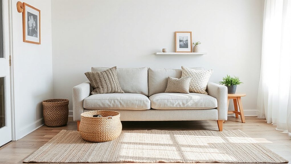
declutter simplify organize refresh

If your space feels flat no matter how much you style it, start by decluttering—fast. Clear surfaces first: coffee table, console, nightstand. Edit to three purposeful items per zone so your eye can rest and your best pieces can read as intentional. Use a minimalist approach: keep what you use weekly, store what you love seasonally, and donate the rest.

Corral loose remotes, cables, and papers into one lidded box, then reset daily in two minutes.

Next, streamline visual noise. Match hangers, reduce pillow variety, and group books by height or color for a cleaner rhythm.

Add natural elements only after you subtract: one leafy stem, a wood tray, or a stone bowl brings warmth without clutter.

Rearrange Furniture to Refresh a Tired Room

Once you’ve cleared the clutter, you can refresh the room fast by rearranging what you already own.

Start by defining a new focal point, then shift key pieces to improve flow and everyday function.

Finally, rebalance scale and spacing so seating, surfaces, and pathways feel intentional and current.

Define A New Focal Point

Although your décor may still be stylish, a room can feel tired when the eye has nowhere fresh to land, so define a new focal point by rearranging your furniture around a single intentional anchor. Choose one statement element and let everything else support it: the fireplace, a large artwork, a sculptural floor lamp, or a bold area rug.

Pull seating to face that anchor and give it breathing room with a clear perimeter. Then tighten the vignette with one edited surface—coffee table, console, or mantel—so the focal zone reads intentional, not cluttered.

For trend-aware focal point ideas, try pairing warm wood with matte black accents, or layering tonal neutrals with one saturated accent. You’ll get a crisp visual centerpiece without buying anything new.

Improve Flow And Function

When your room feels tired, the issue often isn’t the décor—it’s the way you move through it, so refresh the space by rearranging for better flow and function. Start by mapping your main paths: door to seating, seating to storage, and storage to workspace.

Pull the largest piece to anchor the zone, then rotate secondary seating to support conversation and sightlines.

Next, align daily-use items with intuitive reach. Swap a side table for a slim console, or slide a cabinet closer to where you actually drop keys and chargers.

Add discreet storage solutions—lidded baskets, a tray, or an ottoman with hidden space—to reduce visual noise.

Finish with color coordination: group accessories by tone to guide the eye and make the new layout feel intentional.

Rebalance Scale And Spacing

If your furniture feels “off” even after a tidy-up, scale and spacing usually need the reset. Start by anchoring the room with the largest piece, then position secondary seating to create clear sightlines and walking paths.

You’re aiming for scale balance: pair bulky sofas with lighter chairs, and keep low pieces near windows to preserve openness. Pull furniture off the walls when you can; a few inches often makes the layout feel intentional and current.

Next, check spacing uniformity. Keep consistent gaps—about 16–18 inches between seating and a coffee table, and 30–36 inches for main pathways.

Finish by centering key groupings on rugs or lighting, so zones read calm, not crowded.

Use Simple Paint Updates for Big Impact
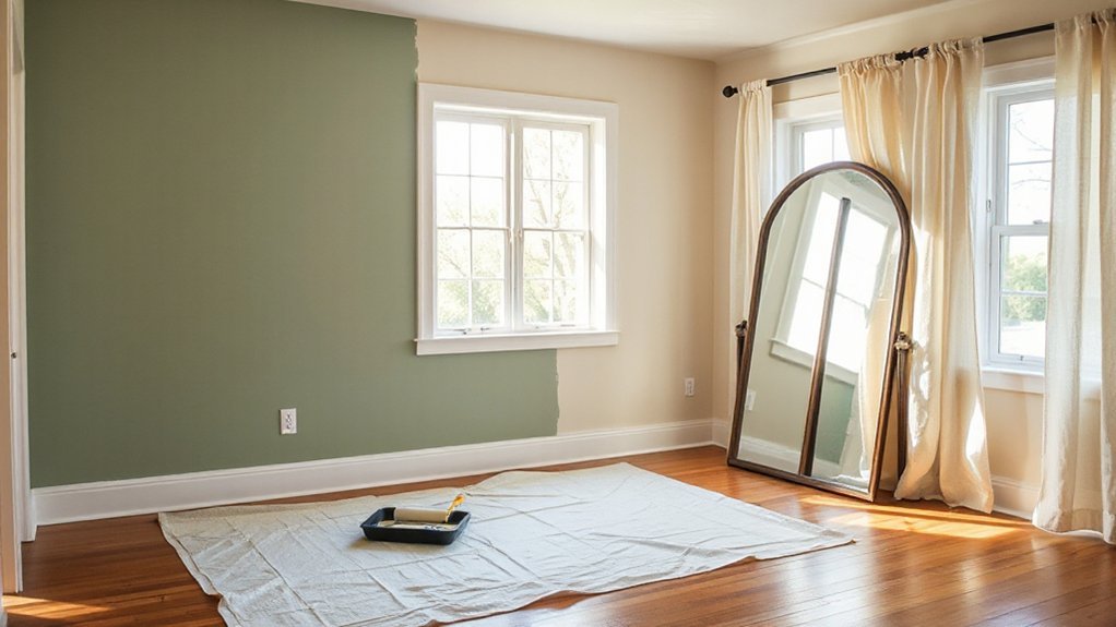
paint color and accent techniques

How do you refresh a tired room without a full renovation? Start with a smarter wall color choice that supports the room’s proportions and mood. If the space feels cramped, you can shift to soft, warm neutrals or a pale tint that visually recedes. If it feels flat, you can add depth with a saturated accent wall or a color-drenched nook that frames a focal point.

Use paint techniques for architectural polish on a budget. Try painting trim a few shades darker than the walls for crisp definition, or go tonal for a seamless, modern envelope.

You can also paint the ceiling slightly lighter to lift the room, or add a half-wall band to anchor furniture and guide sightlines.

Upgrade Lighting for an Instant Lift

Even though paint sets the tone, lighting controls how the room actually reads—its scale, warmth, and focal points. Swap a dated ceiling fixture for a clean-lined pendant or semi-flush mount to modernize instantly.

Then layer your sources: add a slim floor lamp for vertical lift and a task lamp where you read or work so corners don’t fall flat.

For flexibility, install dimmers or try Smart lighting bulbs you can tune from crisp daylight to soft amber. Use Mood lighting to highlight art, shelving, or a favorite chair with a plug-in picture light or adhesive LED strips.

Keep bulb temperatures consistent (2700–3000K) for a cohesive glow, and upgrade to higher CRI LEDs so colors look accurate, not washed out.

Swap Textiles for Color, Comfort, and Texture

Swap textiles to refresh the room’s palette and make it feel more comfortable without changing the layout. You can layer rugs and throws to add warmth and definition.

Then update curtains to introduce a clean hit of color at window level. Finish by mixing pillows in varied weaves and finishes for on-trend texture that reads intentional, not busy.

Layer Rugs And Throws

Two well-chosen layers—one rug underfoot and one throw within reach—can refresh a tired interior faster than most furniture swaps.

Start by scaling up: place a neutral, flatweave base rug to anchor the room, then layer rugs with a smaller patterned piece to define the seating zone and introduce color. Keep the top rug slightly offset for a relaxed, designer look, and let at least 8–12 inches of the base show for contrast.

Next, add throws where you lounge: over the sofa arm, at the end of the bed, or in a basket beside a chair. Mix textures—bouclé, chunky knit, washed linen—to soften hard lines and boost comfort.

Repeat one hue from the rug in your throw for cohesion, not matchy-matchy.

Update Curtains For Color

Where can you add the biggest hit of color without touching a paintbrush? Update your curtains. A new panel instantly reframes the room, pulls together existing tones, and makes windows feel intentional.

Choose Curtain patterns that echo your art or rug—subtle stripes for modern calm, botanicals for a fresh, relaxed vibe, or a solid velvet for depth and warmth.

Dial in the proportions by adjusting curtain length. Hang rods a few inches below the ceiling and extend them past the frame so fabric stacks on the wall, not the glass.

Let panels kiss the floor for a tailored look, or puddle slightly for a softer, boutique feel. Stick to affordable liners to improve drape and light control.

Mix Pillows For Texture

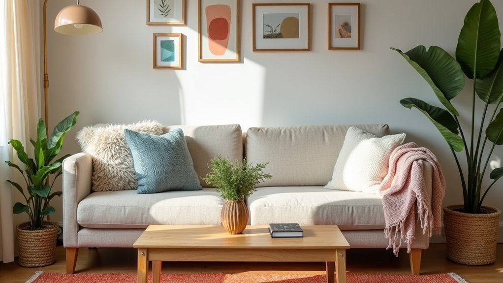
If your room feels flat but you don’t want a major overhaul, mix pillows to add instant texture and a hit of color. Start with a tight palette pulled from your rug or art, then vary materials: linen, bouclé, velvet, and a nubby knit. This Textile pairing builds depth even on a neutral sofa and makes the seating zone feel more intentional.

Use Pattern mixing with a simple rule: one large-scale print, one small geometric, and one solid or subtle stripe. Keep undertones consistent so the set reads curated, not chaotic. Swap in a lumbar pillow to sharpen proportions, and rotate covers seasonally for a low-cost refresh.

Finish with inserts one size larger than the covers for a plush, tailored look.

Restyle Shelves and Surfaces With What You Own

Even when your room’s bones feel dated, you can make it look intentional by restyling shelves and surfaces with pieces you already own. Start by clearing everything, then edit back in thirds: books, objects, and breathing space.

Stack a few books horizontally to create height, then top them with a candle or small bowl for a Personalized display.

Use Surface organization to keep the look crisp: corral remotes on a tray, group like items, and hide loose cords behind books or a box.

Vary finishes so it feels current—mix matte ceramics with glossy glass, or warm wood with black accents.

Anchor each shelf with one larger piece, then sprinkle smaller items forward.

Rotate art, frames, and plants between rooms to refresh the whole view fast.

Add Character With Budget-Friendly Thrift Finds

Once you’ve refreshed your shelves with what you already own, thrift stores become the quickest way to layer in character without spending much. Go in with a tight edit: one sculptural vase, a framed print with a strong mat, or a small brass lamp can shift the room’s mood fast.

During thrift shopping, look for quality materials—solid wood, ceramic, linen—so pieces feel intentional, not random.

Use Vintage accents to add contrast to modern basics: pair an aged mirror with a clean console, or stack worn hardcovers under a sleek candle. Keep your palette consistent and vary texture for depth.

Before you buy, measure key surfaces and check scale against your seating so everything lands balanced and curated. Clean, rewire, or reframe as needed.

Conclusion

You’ve cleared the clutter, shifted the layout, and refreshed the walls—now your space is already breathing easier. But don’t stop yet. The real transformation shows up in the details: a warmer bulb, a layered throw, a rebalanced shelf, a single thrifted accent with attitude. Stand at the doorway and look again. What still feels “off”? Fix that one thing next, and your tired interior won’t just look updated—it’ll feel intentionally designed.…
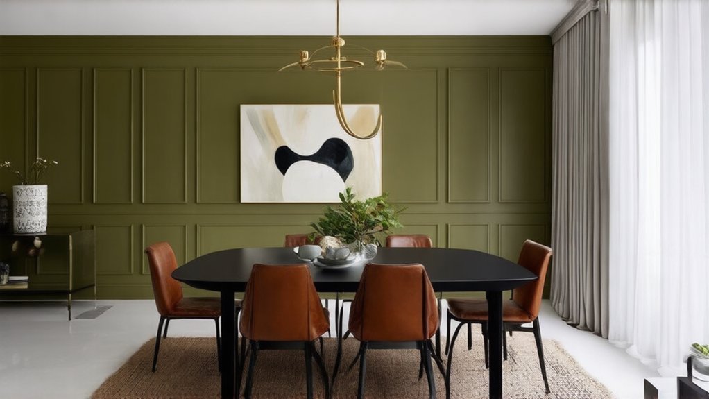
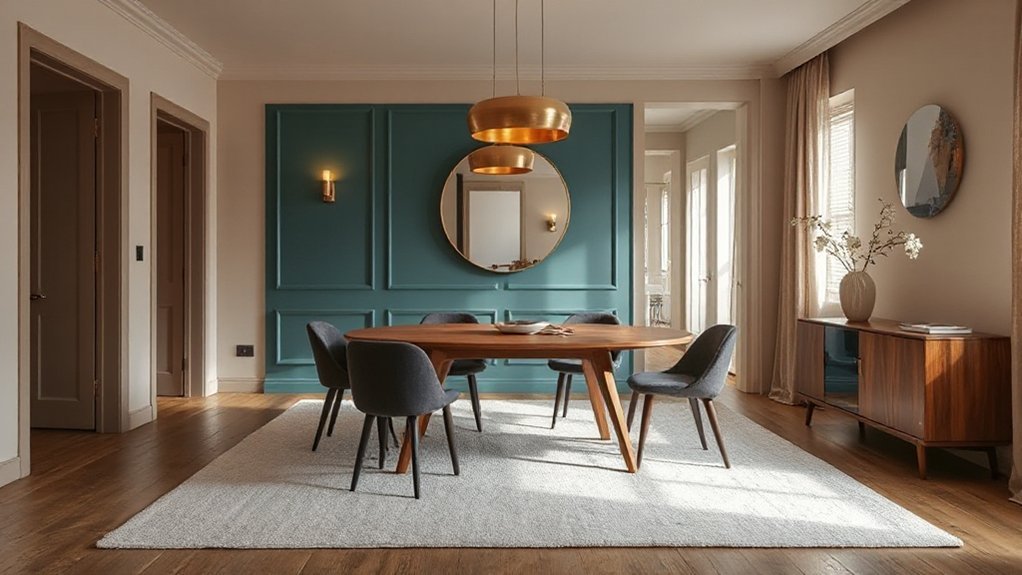
modern dining room ideas
Home Upgrades & Renovations

How to Modernise a Dining Room With Colour, Furniture and Feature Walls

Modernise your dining room by starting with a warm white, greige, or soft clay base, then add one saturated accent like inky navy, forest green, or oxblood. Paint a feature wall behind the table in matte or low-sheen colour, or try limewash for soft texture. Swap bulky pieces for a slim-leg table and airy, low-back chairs. Mix oak or walnut with black metal, glass, and boucle or linen. Add a sculptural pendant on a dimmer, with more ideas ahead.

Key Takeaways

  • Start with a warm neutral base (warm white, greige, soft clay), then add one saturated accent colour like navy, forest green, or charcoal.
  • Create a feature wall behind the dining table using matte paint, limewash, or subtle mural gradients, and echo that tone in accessories.
  • Swap bulky furniture for clean-lined pieces: slim-leg tables, low-back chairs, and streamlined silhouettes to improve sightlines and feel current.
  • Mix modern materials—wood with black metal, glass details, and textured upholstery—to balance warmth and sharpness without visual heaviness.
  • Upgrade lighting with a sculptural pendant and dimmers, using 2700K–3000K bulbs and wall lights to add modern ambience and depth.

Choose a Modern Dining Room Colour Palette

color sets modern dining mood

Although your dining room’s furniture and lighting matter, your colour palette sets the modern tone first. Start with a restrained base: warm white, greige, or soft clay to keep the room crisp yet inviting.

Then add one saturated accent—inky navy, forest green, oxblood, or charcoal—so the space feels current, not busy. Use Color psychology to steer mood: blue calms long dinners, green feels balanced, and deep red sparks conversation when used sparingly.

Track Cultural influences by borrowing proven pairings, like Japanese-inspired taupe with black, or Mediterranean chalk white with terracotta.

Finally, repeat your key tone in textiles and ceramics to create a clean, intentional rhythm across the room.

Add a Feature Wall That Looks Intentional

If your dining room needs a modern lift without a full overhaul, add a feature wall that reads deliberate, not decorative. Anchor it behind the table so it frames gatherings and photographs well. Choose one colour move: a matte clay, inky navy, or smoky olive, then echo that tone in small accents for cohesion.

For artistic wall treatments, consider limewash, colour-blocked panels, or a micro-mural with soft gradients; keep edges crisp with careful taping and aligned switch plates.

Prefer statement wall art? Go oversized and centered, or hang a tight grid with consistent frames and generous spacing. Skip random minis.

Finish with a low-sheen paint or textured plaster so light shifts subtly across the wall.

Swap Bulky Pieces for Clean-Lined Dining Furniture

When your dining set feels heavy in both scale and style, clean-lined furniture instantly sharpens the room’s silhouette and lets your feature wall breathe. Choose a table with slim legs and a refined profile so your wall colour reads crisp, not crowded. Keep chair backs low and airy to open sightlines and highlight contrast between paint, art, and trim.

If you love Traditional styles, edit them rather than erase them: swap carved, oversized chairs for streamlined silhouettes in a classic shape, and keep one familiar detail like a gentle curve. Add Vintage accents through a single statement piece—a petite sideboard with updated hardware or a framed mirror—so the palette stays modern.

Aim for cohesive tones: warm neutrals, inky blacks, or muted greens that look current under evening light.

Mix Modern Materials (Wood, Metal, Glass, Fabric)

Clean-lined dining furniture sets a sharp foundation, and mixing modern materials gives it depth without adding visual weight. Pair a warm oak or walnut tabletop with slim black metal legs to sharpen the silhouette and make colour pop—think clay, olive, or inky navy nearby. Add a glass-front sideboard or a clear centerpiece to keep sightlines open and reflect your wall tones.

Bring in fabric through upholstered chairs in boucle, performance velvet, or textured linen; choose a saturated shade for drama or a pale neutral to soften contrast. Balance sleek surfaces with rustic textures like woven rush seats, raw-edge timber, or a stoneware vase.

Finish with Vintage accents—brass cutlery, smoked-glass carafes, or a patinated tray—for curated, modern character.

Finish With Modern Dining Room Lighting (Layers + Bulbs)

Because lighting lands like jewellery in a dining room, layer it with intention: hang a sculptural pendant low over the table for a focused pool of glow. Add slim wall sconces or a picture light to wash the walls, then tuck a discreet lamp or LED strip in a sideboard for soft after-hours ambience.

Choose bulbs like you choose paint: warm 2700K flatters food and timber; crisp 3000K sharpens black metal and stone. Use dimmers so artificial lighting shifts from dinner-party sparkle to late-night calm.

Let color psychology guide finishes: brass warms greens and terracotta, chrome cools blues and greys, matte black grounds blush and cream. Pick opal glass for soft diffusion, or clear glass to spotlight a statement filament.

Conclusion

Bring your dining room into the now by choosing a confident, modern palette—think warm neutrals punched up with inky blue, sage, or terracotta. Make your feature wall look deliberate with crisp lines, textured paint, or graphic wallpaper. Trade bulky pieces for clean silhouettes, then layer wood, metal, glass, and soft upholstery for contrast. Finish strong with statement lighting plus subtle ambient glow. With these updates, you’ll hit the nail on the head.…

stylish hallway transformation ideas
Home Upgrades & Renovations

Hallway Makeovers: Flooring, Lighting and Decor That Make a Big Impact

Start by mapping your hallway’s real traffic flow, door swings, and drop zones so you keep clear walking width and choose wall-hugging furniture. Brighten fast with high-LRV warm white or greige paint, plus a mirror that bounces light down the corridor. Layer lighting: a flush or semi-flush ceiling fixture, sconces mounted 60–66 inches high, and warm 2700–3000K dimmable LEDs. Anchor it with durable flooring and a runner leaving 4–6 inch borders, then finish with aligned art and tight, curated styling—there’s more ahead on layout, storage, and impact.

Key Takeaways

  • Map traffic flow and keep the lower zone clear; use narrow benches or shelves so the hallway stays open and functional.
  • Upgrade flooring in high-wear areas with durable matte finishes, and add a runner with 4–6 inch borders secured by non-slip pads.
  • Brighten walls with high-LRV paint and a tight, consistent palette that continues into adjacent rooms for a longer, calmer visual line.
  • Layer lighting with a dimmable ceiling fixture plus sconces at 60–66 inches high to reduce shadows and visually widen narrow walls.
  • Create impact with one oversized artwork or a matching-frame gallery grid, hung 57–60 inches to center, with minimal, curated accessories.

Plan Your Hallway Makeover for Traffic and Light

map light measure plan

Before you pick paint or hang art, map how people actually move through your hallway and where natural and artificial light land throughout the day. Measure clear walking width, note pinch points at door swings, and track where bags and shoes naturally drop.

Use that data to choose durable flooring at high-wear zones and slip-resistant runners where turns happen. Layer lighting by task: brighter at closets, softer near bedrooms, and glare-free at eye level.

Plan outlets and switch locations so you don’t block them with consoles or hooks. Keep color coordination tied to adjacent rooms so progressions feel intentional, not chopped.

Lock in furniture arrangement with tape outlines, ensuring drawers open, radiators breathe, and sightlines stay clean.

Brighten the Hallway With Paint, Mirrors, and Walls

Once you’ve mapped traffic and lighting, use your walls as light multipliers: choose a high-LRV paint (warm white, greige, or a soft clay) in an eggshell or satin that bounces light without spotlighting every scuff. Then place mirrors where they’ll reflect a window or fixture—not a blank wall—so the hallway reads wider and brighter.

Keep color schemes tight: run the same wall color through adjacent rooms or shift one shade lighter to extend sightlines. Add crisp contrast with a deeper door color or tonal trim for depth without narrowing the passage.

For wall treatments, try vertical beadboard, slim battens, or micro-paneled wainscoting to lift the eye and disguise dings. In longer corridors, create a gallery grid with matching frames to calm visual noise.

Layer Hallway Makeover Lighting (Ceiling, Sconces, Lamps)

Start with the ceiling fixture, because it sets the hallway’s overall brightness and scale—flush mounts for low ceilings, semi-flush or a slim pendant for taller runs.

Then add wall sconces to layer light at eye level, reduce shadows, and visually stretch narrow walls with evenly spaced, warm LEDs.

Finish with a small lamp on a console or shelf to bring in that boutique-hotel glow and make the pass-through feel lived-in.

Ceiling Fixtures First

Because a hallway’s lighting has to work hard in a narrow, high-traffic space, your ceiling fixture should set the tone and provide the baseline brightness you’ll build on with sconces and lamps.

Start by measuring ceiling height and width so you don’t choose a piece that crowds the sightline. For low ceilings, go with a slim flush-mount; for standard heights, a semi-flush adds depth; for tall entries, a small chandelier elongates the corridor.

Current ceiling fixture styles that read elevated include opal-glass globes, ribbed shades, and matte black or aged brass.

Prioritize fixture placement: center it on the hallway’s axis, then space multiples evenly (about 6–8 feet apart) to eliminate dark pockets and shadows.

Use dimmable LEDs at 2700–3000K.

Add Wall Sconce Layers

With your ceiling fixture setting the baseline brightness, wall sconces add the side-to-side glow that keeps a hallway from feeling like a lit tunnel. Use wall sconce layering to widen the visual field, soften shadows at doorways, and highlight artwork without glare.

Mount sconces 60–66 inches from the floor, then stagger pairs along longer runs so light overlaps instead of creating bright spots. For tighter halls, choose slim profiles or up/down styles that wash the wall and make it read taller.

Trend-forward finishes—aged brass, matte black, or plaster—double as decorative wall lighting while staying quiet in a narrow space. Put sconces on a dimmer so evening circulation feels calm, and match bulb color to your ceiling fixture for a seamless, gallery-like corridor.

Lamps For Warmth

Even if your ceiling light and sconces cover the basics, a small lamp adds the warm, low-level glow that makes a hallway feel lived-in instead of purely pass-through.

Place one on a slim console, a wall-mounted shelf, or a closed shoe cabinet so it doesn’t pinch the walkway. Choose cozy lamps with tapered linen shades, opal glass, or pleated fabric—textures that diffuse warm lighting and soften hard angles.

Scale matters: keep the base narrow, but let the shade sit near eye level to reduce glare and bounce light onto the walls. Add a dimmable LED (2700K) and a plug-in timer so it clicks on at dusk.

In long halls, repeat a matching lamp every 8–10 feet for rhythm.

Choose Durable Hallway Flooring and Runners

In a hallway that gets constant foot traffic, you’ll want flooring that can take a beating—think engineered hardwood, LVP, or porcelain tile in a matte, low-glare finish.

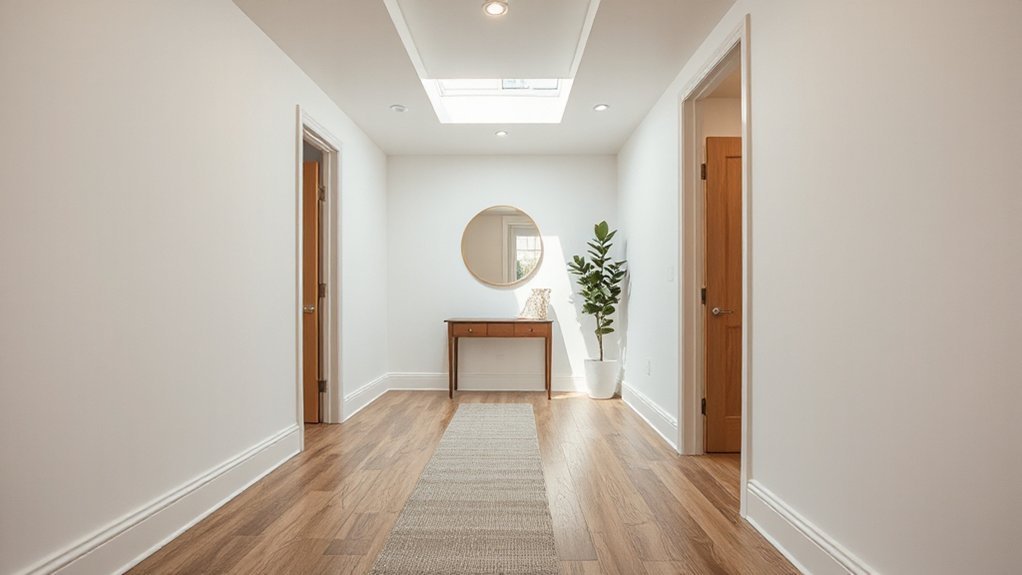
You can visually stretch the space with a runner that’s scaled to the corridor, leaving a slim border of floor showing on both sides and stopping a few inches short of door swings.

You’ll keep everything secure and quiet with a non-slip pad, then stay ahead of wear by vacuuming often, spot-cleaning fast, and rotating the runner for even fading.

High-Traffic Flooring Materials

Where does your hallway take the biggest beating—right at the front door, along the pinch-point by the stairs, or in that narrow strip between rooms? Map those wear zones first, then match them to Durability considerations like scratch resistance, dent tolerance, and easy-clean finishes that won’t show every scuff under raking light.

For Material options, you can’t beat porcelain tile for grit, salt, and wet boots; choose a matte, slip-resistant finish and tight grout lines for a calmer visual rhythm.

Engineered hardwood brings warmth without the movement issues of solid planks, especially in long, linear corridors.

Luxury vinyl plank is trend-forward, quieter underfoot, and forgiving if you’ve got pets.

If you crave softness, pick low-pile, solution-dyed carpet tiles you can swap individually.

Runner Size And Placement

Once you’ve nailed down your wear zones, size and place a runner to protect the traffic line without making the hallway feel pinched. Aim for a runner size that leaves 4–6 inches of floor showing on each side; that border frames the path and keeps narrow halls from feeling like a carpeted tunnel.

In wider corridors, scale up so the runner reads intentional, not lost.

For runner placement, start 6–10 inches from the first threshold and stop short of the last doorway so doors swing cleanly and transitions feel crisp. Center it on the main sightline, not necessarily the wall, especially if you’ve got radiators or built-ins.

Use stripes to elongate, or a low-contrast pattern to hide daily scuffs and grit.

Non-Slip Pads And Care

A well-sized runner only works if it stays put, so lock it down with a non-slip pad and a simple care routine that matches your hallway’s traffic. Choose felt-rubber blends for hardwood, and grippy PVC for tile; trim to sit 1 inch inside the runner’s edge so it disappears visually while gripping the full stride zone.

For hallway safety, vacuum weekly with the beater bar off to protect low-pile trends and prevent edge curl. Spot-clean spills fast, working from the outer ring inward, then blot dry so moisture doesn’t migrate to seams.

Every month, lift the runner to air out both sides, check for pad residue, and rotate end-to-end to even wear at the entry and turn points. Replace non-slip pads once they flatten.

Add Slim Hallway Storage (Hooks, Shelves, Benches)

slim vertical hallway storage

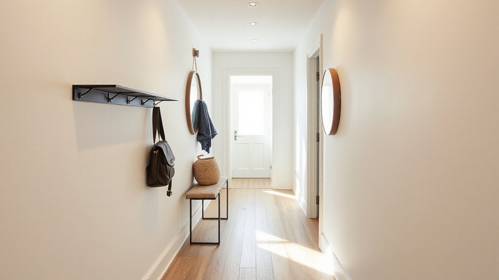
Even if your hallway measures only a few feet wide, you can carve out high-function storage by keeping everything slim, wall-hugging, and vertically stacked. Choose slim storage like a 4–6-inch-deep picture ledge for keys and mail, and mount hallway hooks in a tight grid to hold coats, bags, and dog leashes without spreading out.

Add a shallow floating shelf above the hooks to park hats or baskets, and keep the lower zone clear for smooth traffic flow. If you need seating, pick a narrow bench (10–12 inches deep) with a lift-top or cubbies; it gives you a landing spot for shoes while hiding clutter.

Finish with matching hardware and aligned heights so the wall reads calm, not crowded.

Finish Your Hallway Makeover With Art and Styling

Because a hallway is mostly movement and first impressions, art and styling have to work fast: set a clear focal line at eye level, then build a tight, intentional vignette that doesn’t pinch the pathway.

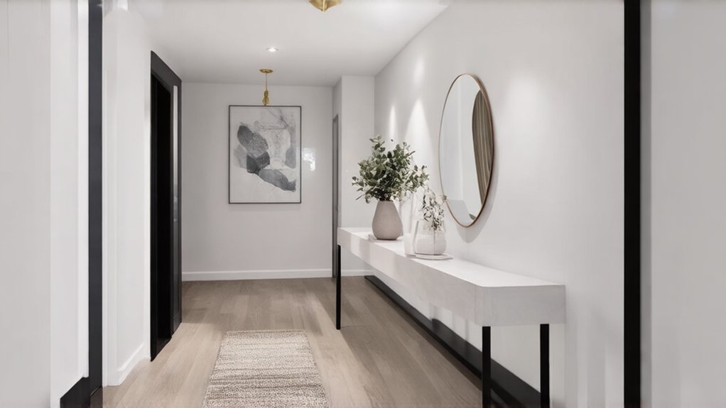
Anchor the space with one oversized piece, or run a clean gallery in matching frames with consistent mat widths for a crisp art arrangement. Keep spacing 2–3 inches, and align centers at about 57–60 inches from the floor.

Use a picture light or wall-wash sconce to flatten shadows and boost color.

On a slim console, layer styling accessories with varied heights: a catchall tray, a narrow vase, and one sculptural object.

Edit hard, then repeat one metal finish to tie it together.

Conclusion

It’s funny how the “in-between” space ends up doing the most. When you plan for traffic flow and tame the light, your hallway stops feeling like a pass-through and starts reading like a room. You’ll bounce daylight with paint and mirrors, stack lighting from ceiling to sconces, and ground it all with a durable runner. Add slim hooks or a perch, then finish with tight-framed art—suddenly, the smallest footprint makes the loudest statement.…

Scroll to Top